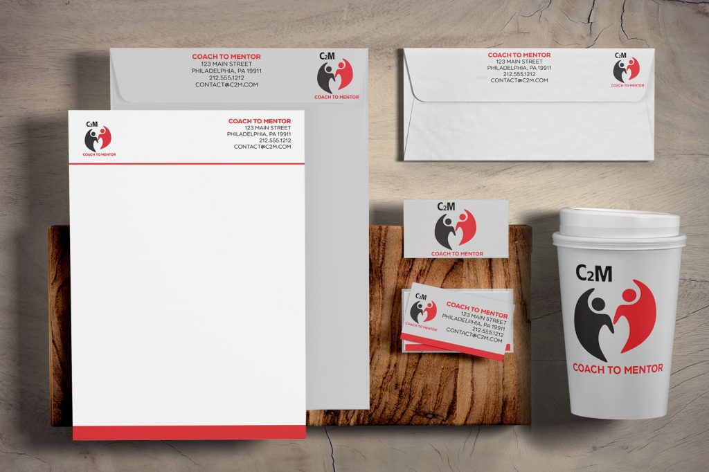
For this logo design, the client wanted a concept that reflected their program’s mission of teaching coaches to use their expertise to mentor others, providing guidance, support, and feedback. To visually represent this idea, I created a design featuring two interconnected yet distinct person icons. One figure is positioned slightly higher than the other, symbolizing the mentor guiding and uplifting the mentee. Their placement also conveys a sense of collaboration, as they appear to be high-fiving each other, emphasizing mutual growth and encouragement within the program.
This is the logo I designed for my virtual assistant company, ExecAssist. To emphasize the connection between executive assistance and virtual assistance, I experimented with typography by extending the arm of the “X” and the overhang of the “V” to create a visual link. To further highlight this connection, I incorporated a pen and ink line between the two elements, symbolizing collaboration and professionalism. The design reflects the seamless integration of services that ExecAssist provides to its clients.
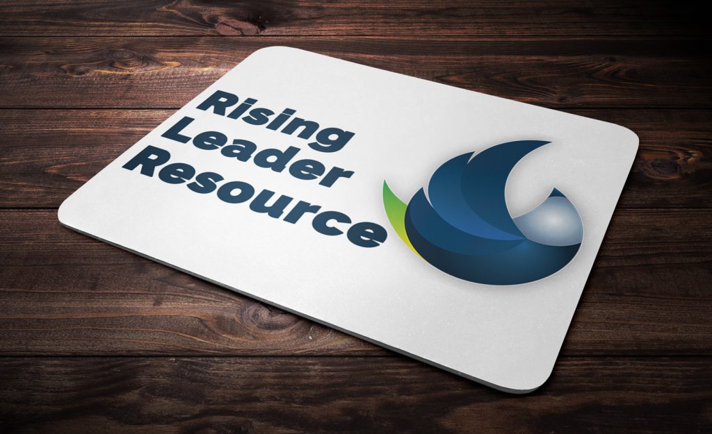
For the Rising Leader Resource logo, I was tasked with designing a symbol that represented a resource for emerging leaders. I envisioned a bird in flight, its wings spread wide, soaring upwards. This imagery conveys the idea of ascension and growth, symbolizing the support and guidance that the Rising Leader Resource provides to help leaders rise to new heights. The bird’s upward trajectory embodies the journey of personal and professional development, while its outstretched wings evoke a sense of freedom and empowerment. This design effectively communicates the resource’s mission of empowering leaders to reach their full potential.
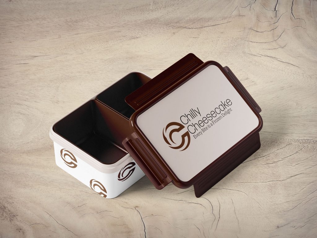
For the Chilly Cheesecake logo, I was tasked with designing a visual identity that embodied the essence of the frozen treat. I envisioned a creative approach where the letter “C” would be stylized to resemble the cheesecake itself, incorporating swirls in the shape of a “C” in a rich, deep chocolate color. This design concept aimed to visually connect the brand with the product, making the logo both recognizable and appealing to customers.
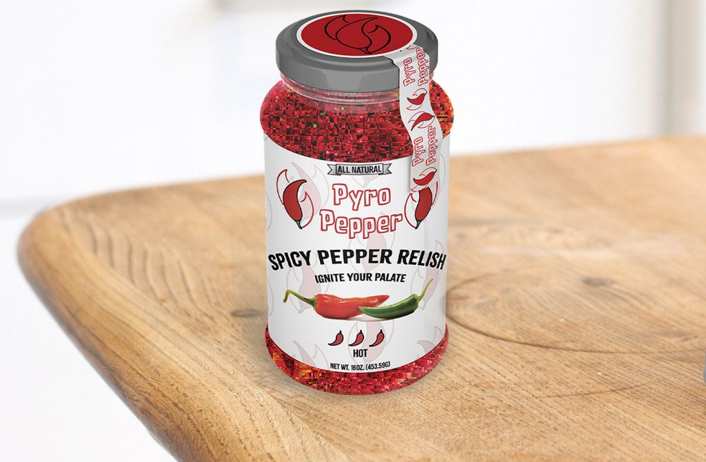
For the Pyro Pepper logo, I was tasked with designing a visual identity that captured the essence of the spicy pepper relish. To achieve this, I created an illustration of a chili pepper standing upright, symbolizing the core ingredient of the relish. I then overlaid the pepper with a flame shape, effectively conveying the spicy and fiery nature of the product. This design combination not only highlights the pepper but also visually communicates the intense flavor profile of Pyro Pepper relish, making it instantly recognizable and memorable.
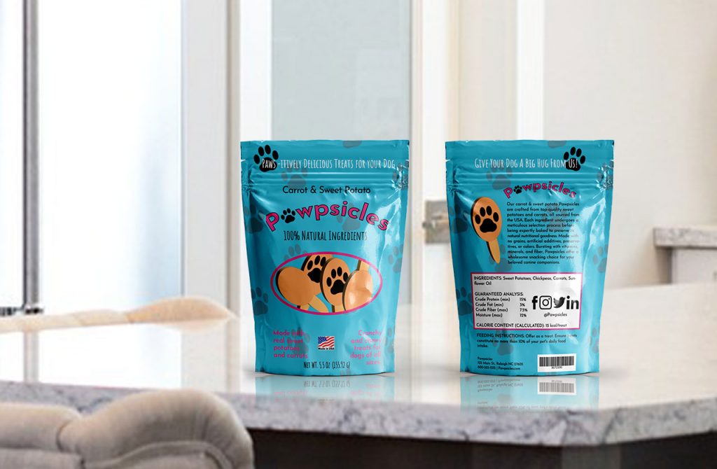
Pawpsicles commissioned me to design a logo for their all-natural dog treats. To capture the playful essence of the brand, I utilized typography creatively. I chose a clean-looking font and used a bright pink color to convey a sense of joy and friendliness. Additionally, I incorporated a paw print in place of the letter “a,” seamlessly integrating the brand’s focus on dogs into the design. This approach resulted in a logo that is both visually appealing and instantly recognizable, effectively communicating the brand’s playful and natural identity.
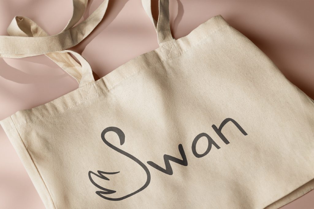
Swan commissioned me to design a logo for their new soda water, emphasizing simplicity and elegance to reflect the product’s high-end nature. I crafted the letter “S” into the shape of a swan, creating a visually striking and symbolic connection to the brand name. To complement this design, I hand-drew the font to match the swan-inspired “S,” ensuring a cohesive and refined aesthetic that aligns with the premium quality of the soda water. This approach resulted in a logo that is both sophisticated and memorable, effectively communicating the brand’s upscale identity.
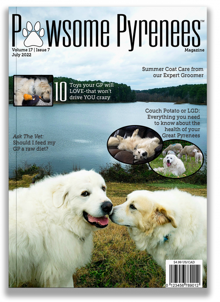
For the brand refresh of Pawsome Pyrenees magazine’s logo, I aimed to capture the fun and informative essence of the publication. To achieve this, I selected a modern, tall, and narrow font that would effectively fill the top of the magazine cover, creating a visually appealing and contemporary look. To add a playful touch, I replaced the letter “a” with a paw print, seamlessly integrating the magazine’s theme into the design. This creative approach resulted in a logo that is both engaging and recognizable, perfectly reflecting the magazine’s lighthearted yet informative content.
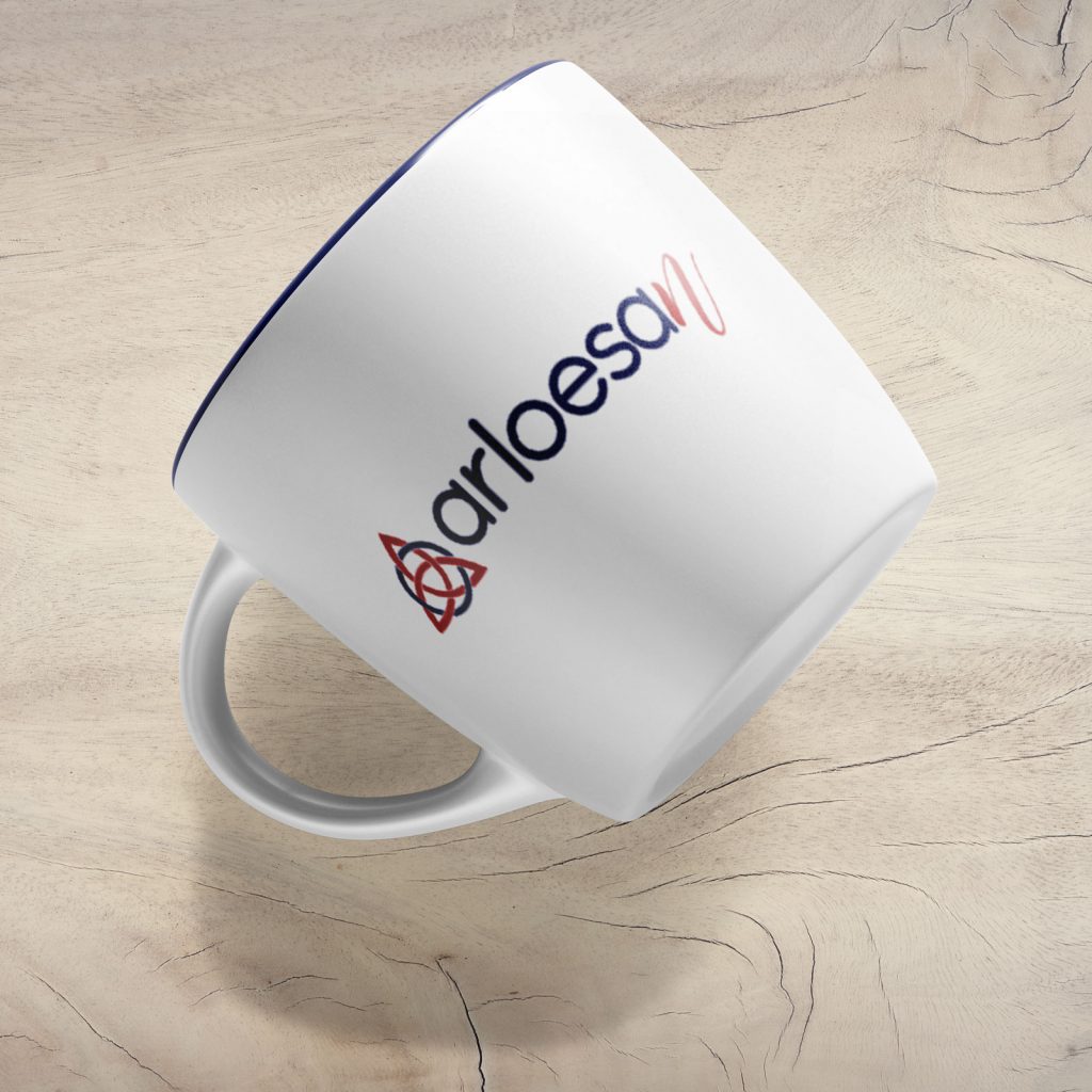
I was commissioned to design the logo for Arloesan, a name rooted in Welsh heritage, meaning “pioneer” or “trail-blazer.” To honor this ancestry, I incorporated elements of Welsh Celtic design while maintaining a modern aesthetic. I chose a classic sans-serif font in all lowercase letters to convey simplicity and approachability. To add a touch of elegance and drama, I used a script “n” at the end of the word. The overall design blends cultural tradition with contemporary style, reflecting the innovative spirit embodied by the name Arloesan.
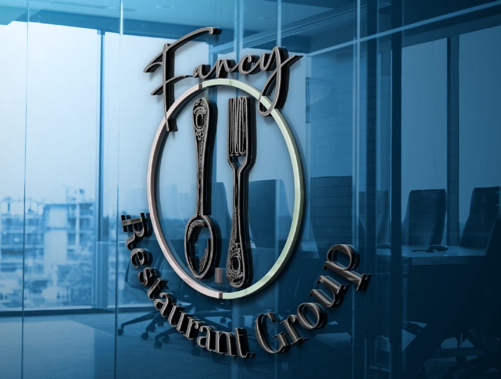
Fancy Restaurant Group commissioned me to design a logo for their restaurant conglomerate. To create a sophisticated and elegant visual identity, I centered a hand-drawn spoon and fork within a circle. I paired a script font for “Fancy” with a classic serif font for “Restaurant Group,” arranging the text to follow the circular shape. This design combines the warmth of hand-drawn elements with the refinement of script and serif typography, effectively conveying the group’s commitment to fine dining and culinary excellence.
